| |
 Site Navigation
Main
News
Forums
Games
Games Database
Top 100
Release List
Support Files
Features
Reviews
Previews
Interviews
Editorials
Diaries
Misc
Download
Gallery
Music
Screenshots
Videos
Miscellaneous
Staff Members
Privacy Statement
|
 |
|
|
SlamDunk
Village Leader


Joined: 26 Dec 2001
Posts: 86
|
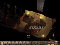
You can see the worthplaying.com watermark there on lower right corner. Here's the WP news post:
http://www.worthplaying.com/article.php?sid=25123
I'd be happy to get those pics without the watermark, though 
_________________
one two tree |
 Sun May 08, 2005 8:53 am
 |
|
|
Sem
Solid as a Rock

Joined: 01 Mar 2004
Posts: 3386
Location: at the Dot |
One word: PHOTOSHOP
Here you go:


_________________
"Who are we to call this planet Earth, when it's clearly Ocean."
-- News Editor of GothicDot --
-- Moderator of the RPGDot Shadows --
|
 Sun May 08, 2005 10:24 am
 |
|
|
MSG
Village Dweller


Joined: 08 May 2005
Posts: 8
|
You mean you enlarged the official small Screens with photoshop? But how with this Quality and so acrid(hope thats the right english word...)? Dont thought that this is possible..^^" and in WoG i already opened a Thread and nobody has seen it before: My WoG Thread
_________________
Currently Playing: GuildWars / Character: Less Isgaroth Necromancer|Elementalist
I come from the german Community (WoG) so sorry for my bad English.. hope you understand me  |
 Sun May 08, 2005 12:28 pm
 |
|
|
nasos_333
Head Merchant

Joined: 13 Sep 2002
Posts: 53
|
I think he just meant that he photoshoped the mark or worthplaying. There is NO WAY to get that detail from lower res screens. |
 Sun May 08, 2005 12:46 pm
 |
|
|
Sem
Solid as a Rock

Joined: 01 Mar 2004
Posts: 3386
Location: at the Dot |
quote:
Originally posted by nasos_333
I think he just meant that he photoshoped the mark or worthplaying. There is NO WAY to get that detail from lower res screens.
Exactly, Slamdunk wanted them without the Worthplaying.com logo, so I shopped them away.
There is indeed NO WAY to get that detail from lower res screens. 
_________________
"Who are we to call this planet Earth, when it's clearly Ocean."
-- News Editor of GothicDot --
-- Moderator of the RPGDot Shadows --
|
 Sun May 08, 2005 2:41 pm
 |
|
|
SlamDunk
Village Leader


Joined: 26 Dec 2001
Posts: 86
|
Nice. That's pretty impressive chopping Sem 
_________________
one two tree |
 Sun May 08, 2005 4:38 pm
 |
|
|
TheCleric
Fearless Paladin


Joined: 11 Jan 2002
Posts: 230
Location: Upstate NY, USA |
Nice Pics!
I have to agree with those who feel that the web pics look too dark and "washed out". As though they're depicting a cloudy day that's about to rain and everyghing just looks "Blah".
I really hope that they work on the color saturation levels before release.
All in all though, it's looking good. I can't wait to get this baby on my Hard Drive! |
 Sun Jul 03, 2005 11:49 pm
 |
|
|
|
Goto page Previous 1, 2
All times are GMT. The time now is Thu Apr 11, 2019 6:10 pm
|
|
|
|
|
|
|


