|
|
|
Main News Forums Games Games Database Top 100 Release List Support Files Features Reviews Previews Interviews Editorials Diaries Misc Download Gallery Music Screenshots Videos Miscellaneous Staff Members Privacy Statement |
Earth & Beyond Review by Ekim, 2002-10-24 In a world where MMORPGs battle for a rapidly growing player base, it's very hard to find innovation. Since some developers already have found a winning formula, others new to the genre attempt to copy the successful model and hope that it will be as good or even better than their competition. Earth & Beyond actually achieves to make a MMORPG similar to those that are already successful, and brilliantly incorporates known and familiar features into a new environment (space), but ultimately fails at delivering what others have already managed to in more traditional settings. Earth & Beyond, although far from being a failure, implements some things the wrong way, or try new things that should have stayed the same. It tries to impress, but in the end the innovation is only a thin veil of familiar things done differently. In essence, Earth & Beyond is a perfect beginner's MMORPG that will appeal to those who have little to no experience with the genre, but might disappoint the hardened veterans.
Launch I want to start by talking about a critical aspect of any MMORPG: the launch, or the first 'Live' week. Many games before Earth & Beyond (E&B for short) have made a mess of their launch, and the new trend for developers now is to insure that the first few critical days of an MMORPG's existence is as flawless as possible. Last year DAoC (Dark Age of Camelot) achieved a next to uneventful launch. There were a few bugs here and there, but nothing major or show stopping had occurred for those lucky enough to get in the game early. It was the first completely successful launch of an MMORPG in the genre's short history. I'm happy to report that E&B's launch was even better. The first few Live days were quiet. There were no bugs, no down time, no incident whatsoever aside from a few hours of lag which were quickly dealt with by the live team. There were no big patches to download before getting in the game (a small patch was required, but it weighed in at less than 5MB) and so anyone was able to enjoy the galaxy as soon as the game was installed on their hard drives. Westwood deserves praise for the flawless launch, because I'm sure this was no small feat!
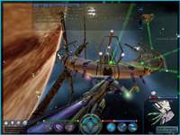
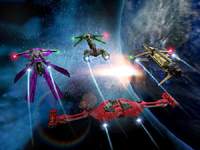
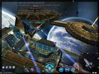
Creating a character Another critical feature in any MMORPG (any CRPG for that matter) is the creation of your very own avatar, the character that, in most cases, you will live with for the rest of your online life. E&B's system is simple almost to the point of being limiting. The game's classes are three in number: Warrior, Explorer and Trader. Three more classes are added for good measure. They are hybrid classes: Trader/Warrior, Explorer/Warrior and Warrior/Explorer. There is no customization here. You choose a race (Terran, Jenquai, or Progen) and within each race you will be given the choice of two classes, one core class and another hybrid. If you want to be a Progen Explorer/Trader, you're out of luck. Of course, this is a minor knit-pick. But still, the more freedom you give the player, the more possible different starting combinations, the happier players are. As it stands the choices are far too limited. Westwood has three more classes in the works, but as of this writing they are still unavailable and so I cannot comment on them. Next you will need to customize your character's appearance. This customization phase is very exciting, and has a lot of options. You can make your character look as cool, or as menacing as you wish, and it's fun to play around with the many possibilities. It's just a shame that you don't get to see more of your character in the game though, as most of the action is played out in outer space and the ships are what will really identify players. 90% of the game is played out in outer space, with a few occasional stops in stations where you walk around with your avatar. Yet for some reason your ship has very limited options for customization. You have 3 different choices of wing types, and 3 different types of hull to choose from. The only other thing you need to customize are the colors. So that means that within each race/class combinations there are 9 possible shapes of ships you can encounter, although they will vary greatly in color. Perhaps more effort should have been put into the possible customization of ships rather than the characters. The ship designs are still quite nice, and you will have fun trying to get the perfect look. Graphics E&B's Graphics are superb. The first time you enter the Saturn System is awe inspiring, and you sometimes get the feeling you're really in space flying familiar territory. Everything here is a 3D object, so planets get bigger and bigger as you fly towards them, and far away objects that you see when you first get in the system can often be approached and studied up close after a few minutes of flying. In terms of beauty, think of Homeworld, but on a grander scale. Gorgeous backgrounds and lush colored clouds of vapor, asteroid fields that stretch as far as the eye can see, small moons and huge planets, as well as the ship and station designs found throughout the galaxies are all top notch. Some planets can be landed on, and the graphics are as superb on the surface. There is much to be said about the attention to detail that went into the visual design of this game.
Sound and Music E&B has decent sound, which fit right into the environment. We're not talking about anything revolutionary here. This is the garden variety Sci-Fi sounds, with lasers and missiles and engines going at warp speeds. Yet without being revolutionary, they fill the environment with a certain familiarity. They are both well done, and well integrated in the game.
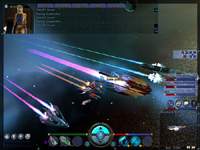
Gameplay E&B's gameplay is quite straightforward and unassuming. Every function seems to be where it should be, and if it's not to your liking then you can easily re-map the keyboard keys to match your desire. Ship controls handle well, although the same controls within stations feel slightly awkward the first few times you find yourself walking around on foot. Interface I only want to touch upon the interface very briefly. For the most part, E&B's interface and GUI (Graphic User Interface) is perfect and very easy to manage. My only complaint is the chat window. In most MMORPGs, the chat window is located on the bottom of the screen. Most if not all also allow you to customize this GUI by moving the windows and tool bars around to your heart's content. Not so here. The chat window is locked to the top side of the screen, with the shields and hull health bars along with the tool bars on the bottom. I myself (and there must be many like me) am used to looking towards the bottom of the screen for chat. I often realized I hadn't even looked at the chat window for the last 20 minutes, and people thought I was ignoring them because of it. I could never find a way to move the chat window where it would have been more convenient for me, and that made my life very difficult out in space... This is how we rate |
|||||||
|
All original content of this site is copyrighted by RPGWatch. Copying or reproducing of any part of this site is strictly prohibited. Taking anything from this site without authorisation will be considered stealing and we'll be forced to visit you and jump on your legs until you give it back. |
||


